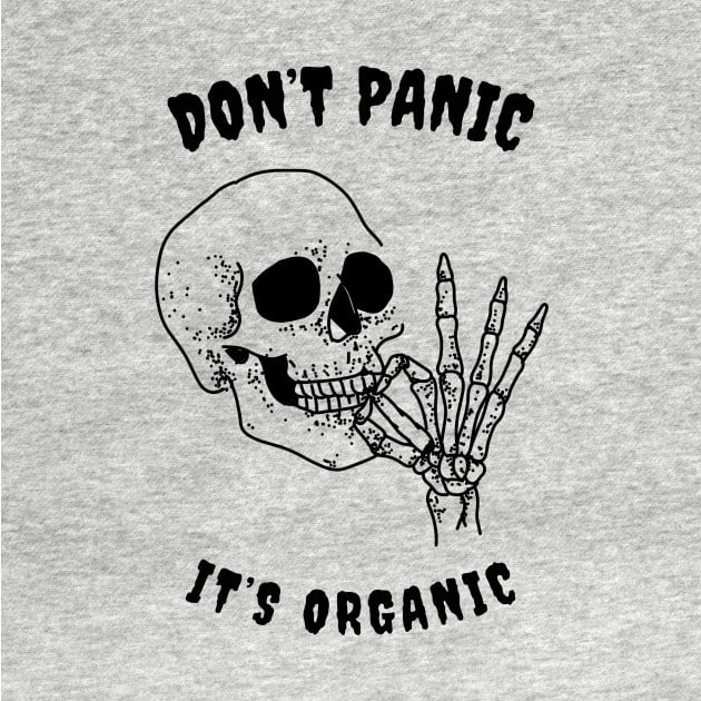

The designer is Kostya Petrenko (aka kxdgraphics on IG)
You must log in or register to comment.
I would genuinely love to have stickers or tees of any one of those
A distressed ringer tee of any of these would give the perfect “thrift store find” vibes
Damn, the music and the aesthetics of the logos in the vid make the digital future actually seem bright, hopeful and exciting.
I love these
This has been done many times already.
Far from original.Complaining about a lack of originality is also a tired old recurring comment. Just use the downvote button and move on.
I will comment whatever I want.
You have zero say in this.Exactly my point.
This whole thread sucks and I feel dumber for having read it
Impossible
Cry more.
get fucked, and stop following me like a stalker.
FreakToday in Lemmy News: Lemming with nearly 500 comments in less than one month expresses concern, outrage when same user mocks two separate shitty hot takes within 48 hours.
I see you failed statistics.
Stalker freak going trough my comments again.
Why don’t you get back to Reddit or your moronic memes?
Now let me block you loserBro count your downvotes, that it’s the same person twice is absolutely a coincidence given how much you post and the fact that you fucking suck at it
I give them a month before they go back to Reddit. I’ve learned Lemmy as a whole will tolerate being stupid or an asshole, but has little patience for stupid assholes.
I don’t want ‘bro’ characters to talk to me.
And who TF cares about downvotes? LOL
Now piss off assholedoesn’t want people to talk to them
posts 300 times a day
Aren’t you lovely
I was expecting Orwell references.
Man I wish we’d go back to fun and unique logos. Now everything is minimalist lower case crap that looks the same
What, you don’t like every app icon being a white logo on a rounded blue square?

(go count yours, I personally have 19)
You blue yourself.
I think you got an e-mail.
22 if I’m generous with the definition
Even android stopped supporting shaped icons to feel like apple where you only have stupid rounded squares. Thank you overlord google for plain boring corporatism when you could have chosen interesting thing you already did
Even android stopped supporting shaped icons to feel like apple where you only have stupid rounded squares. Thank you overlord google for plain boring corporatism when you could have chosen interesting thing you already did
Android didn’t stop anything. You’re phone’s launcher did. Try a third party launcher today!
I use third party launchers, but that’s not the point, very few apps support them because google (and consequently Android) stopped caring. Of course, it might just be corporates being corporates, but I just don’t see why google doesn’t want them
Wdym apps don’t need to support launchers
Aren’t we all satin bowerbirds at heart? Gotta collect that blue.
deleted by creator
never realized that discord’s logo is supposed to be a console controller
It’s way too squished to me to see it as that, the problem with minimalism I suppose. I always saw it as a weird little face, like for Wumpus or a different strangely shaped creature.
it looks like some sort of dog-pig-goat hybrid, with long floppy ears that hug the head.
All these go hard as fuck
the symbols on the spotify and youtube logos are my favourite, i miss that kinda thing and especially how they’d be embossed on products, like the logo on sony ericsson phones.
They look better to me.
they have personality, character, and charm
Because they aren’t minimalistic and “safe”
Man, a lot of those are really excellent designs
1984 flickered a lot
It’s what the yout’s think the 80’s looked like.
Needed more rolling shutter and film grain. Also sepia tone.
Or it actually did look that way and our brains were just trained to look past it because it was in everything
I enjoyed this way more than I thought I would.
Thanks for sharing!
So much better than the boring “corporate Memphis” art style pretty much every company adopted