

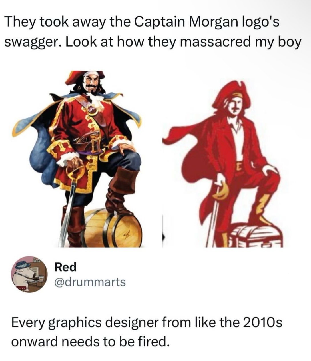
My guess is this saved somebody money.
Simpler design = fewer colors = lower printing cost.
Sometimes this can just be ink cost. Sometimes it can make discrepancies between printers less noticable.
Could still be the other things too
Generally it’s not much savings if any to do more than 1 spot color instead of full process cmyk. It might even be more expensive since it’s a new setup for the printer. Given the volumes they’re printing at it’s probably basically a wash.
I heard somewhere before that often these simplistic logo changes are due to how they look on thumbnails, mobile devices etc. Unsure of the evidence there but it made sense to me. I still hate it though.
Can’t wait to download My Captain Morgan app and… Drink?
Lol like when the iPhone was first getting big and there was those “drinking apps” where you turn the screen and pretend to drink.
Okay but then why is he less buff??
Less ink, obviously
Version on the right has poor posture and almost certainly plays bass.
Checking the important things - Sailor Jerry looks like it’s still the same. Can’t tell if the pinup girl is still on the inside of the label though.
Redrum. RedRUM. REDRUM.
Screw minimalism
Screw emasculation too
Femboy Captain Morgan would be so much cooler than this. Astolfo wouldn’t be caught dead in a polo shirt.
deleted by creator
lol I don’t feel emasculated. Captain Morgan got emasculated.
What a reach
I mean, as far as these new logos go, it’s not the worst.
Why did they turn him into the Tampa Bay Mascot Bucco Bruce?
less ink colors when printing. they are pinching pennies everywhere to deliver more profits.
deleted by creator
Old boy is about to pop open that keg and have a great time with the guys.
New dude is pondering investment plans to maximise return on investment from that treasure chest.
This is the definitive proof that money doesn’t bring happiness.
Went from a pirate to a port town customs agent
New dude is grinning and hoping to be forgiven for showing up late to his niece’s sixth birthday party.
If you look at the people in advertisements, you see the demographic that the company is targeting to buy their product. If you think that’s what the new captain looks like, maybe it will be a successful change for the company, even if the loud voices on the internet don’t like it.
A graphic designer in this case is really following orders from a long command chain, I assure you
Screw the corporate command chain
It actually looks like they put the logo in a business uniform. Surprised they didn’t give him a tie.
It’s probably part of an ongoing trend. There’s been sort of a renewed interest in legacy branding in some parts of the brewing world. I would say Miller kind of kicked it off 10 years ago when they rebranded Miller Lite using an updated version of their 1973 can. It was very successful. I actually did a marketing study on it for a project at work around that time.
Since then, several old beer brands have been resurrected. Hamm’s, Heileman’s Old Style, PBR, just to name a few. If you start seeing Fallstaff at your local liquor store, you’ll know we’ve come full circle.
Rum is horrible anyway. Who cares. But yeah, terrible new mascot. The cosplay comments are spot on.
Edit: you want a gawdawful hangover? Rum is your copilot.
As little a hangover as possible? Straight vodka.
Sipping a complex drink with thousands of years of history? Proper single malt whisky from Scotland.
deleted by creator
I like Rum with root beer
I’m afraid you are incorrect. The root beer is fine though.
Ahh, well that’s okay at least you like root beer
Food of the gods.
They shrunk his shoulders, makes him look soft.
They took the serotonin out of his posture. Makes him look uncertain.
Looking closer they also removed muscle.
Why would we stand for this. Take the streets. Bring your green hat.
Is it because they tried to make him less masculine?
Are you asking because you don’t know?
I honestly have no idea why they changed the logo
I think the cost saving on color printing like someone mentioned elsewhere makes a lot of sense.
At a time when mostly all corporations are raking in millions in profit, now they choose to reduce a small amount of color? Lol, it’s funny
“they” lol.
It’s not like Mr. Corporation said “Cleatus! reduce the colors needed to print this sticker! That’s what’s going to make us a profit for this quarter!” Instead, Cleatus and his logo team are incentivized to cut as much cost as they can because they get a bonus every quarter based on how much money they save the company. So someone on his team whose expertise is in label manufacturing for the company pointed out that they could save a fraction of a penny per sticker by reducing the amount and variety of ink it takes to produce the sticker.
That and/or someone in advertising has decided that now, statistically, is a good time to rebrand, and what I said above in combination with the current trend of minimalism means that this new logo fits all the criteria while saving money.


